更新日:、 作成日:
エクセル グラフの作り方
はじめに
エクセルのグラフの作り方を紹介します。
タイトルや凡例や軸などを表示できます。色やスタイルを変更したり書式設定を変更できます。
グラフの作り方
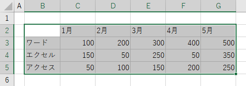
グラフ化する [データ] を見出しも含めて範囲選択します。
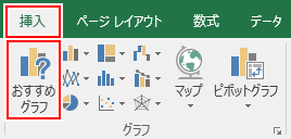
[挿入] タブをクリックし、グラフグループにある [おすすめグラフ] をクリックします。
[すべてのグラフ] タブをクリックして、ここから作成したい [グラフ] をクリックして [OK] をクリックします。

グラフが作成されました。
[グラフ] をクリックするとリボンにグラフツールが表示され、グラフの隣にボタンが表示されます。
ここからタイトルや凡例の表示、色などグラフの書式設定を設定できます。
スポンサーリンク
グラフタイトルを表示する
[+] をクリックして [グラフ タイトル] をチェックします。
詳しくは「グラフにグラフタイトルを表示する」をご覧ください。
凡例を表示する
[+] をクリックして [凡例] をチェックします。
詳しくは「グラフに凡例を表示する」をご覧ください。
軸ラベルを表示する
[+] をクリックして [軸ラベル] をチェックします。
詳しくは「グラフに軸ラベルを表示する」をご覧ください。
軸と単位を表示する
[+] をクリックして [軸] をチェックします。
詳しくは「グラフに軸と単位を表示する」をご覧ください。
データの値を表示する
[+] をクリックして [データ ラベル] をチェックします。
詳しくは「グラフにデータの値を表示する」をご覧ください。
グラフのレイアウトを設定する
グラフのタイトルや軸ラベルなどをまとめて設定できます。
[デザイン] タブをクリックし、グラフレイアウトグループにある [クイックレイアウト] をクリックしてこの中から [レイアウト] を選択します。
グラフが選択したレイアウトで表示されます。
詳しくは「グラフのレイアウトを設定する」をご覧ください。
グラフの色を変更する
[ふで] をクリックし、[色] をクリックしてこの中から変更したい色をクリックします。
詳しくは「グラフの色を変更する」をご覧ください。
グラフの書式設定を変更する
[書式] タブをクリックし、現在の範囲選択グループにあるグラフ要素の [▼] から [要素] を選択して [選択対象の書式設定] をクリックします。
詳しくは「グラフの書式設定を変更する」をご覧ください。
スポンサーリンク