更新日:、 作成日:
エクセル セルの中にグラフを表示する
はじめに
エクセルのセルの中にグラフを表示する方法を紹介します。
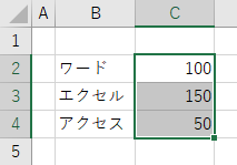
データを範囲選択し ホーム > 条件付き書式 > データバー から、各セルの値を棒グラフで表示できます。
挿入 > スパークライン から、複数のセルの値を 1 つのセルに折れ線グラフや棒グラフなどで表示できます。
条件付き書式でグラフを表示する
グラフを表示する [セル] を範囲選択します。
[ホーム] タブをクリックし、スタイルグループにある [条件付き書式] の [データバー] から [グラフ] を選択します。
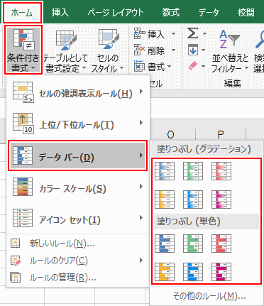
範囲選択したセルの最大値と最小値を元にして棒グラフが表示されます。

色など書式を変更する
条件付き書式が設定されている [セル] をクリックします。
[ホーム] タブをクリックし、スタイルグループにある [条件付き書式] から [ルールの管理] をクリックします。
[ルールの編集] をクリックします。
ここから色や最大値と最小値などを変更できます。[棒のみ表示] をチェックするとセルの値が表示されなくなります。変更したら [OK] をクリックします。
書式が変更されます。
スポンサーリンク
スパークラインでグラフを表示する
[挿入] タブをクリックし、スパークライングループにある [折れ線] や [縦棒] などをクリックします。
[データの範囲] をクリックし、グラフの値となる [セル] を範囲選択します。
[場所の範囲] を削除してから、グラフを表示する [セル] を範囲選択して [OK] をクリックします。
データの範囲の 1 行の値が場所の範囲の 1 つのセルに折れ線や縦棒グラフで表示されます。
色や書式を変更する
グラフが表示されている [セル] をクリックします。
[デザイン] タブをクリックし、表示グループからマーカーなどを表示できます。スタイルグループからグラフの色を変更できます。
軸を日付に合わせる
1月、2月、4月 のように日付の間隔が一定でないときに、グラフを日付の間隔に合わせて表示できます。
グループグループにある [軸] から [軸の種類 (日付)] をチェックします。
日付の入った [セル] を範囲選択して [OK] をクリックします。日付は文字ではなく日付形式の値である必要があります。
日付の間隔と同じようにグラフが表示されます。
最大値と最小値を変更する
グループグループにある [軸] から [ユーザー設定値] をクリックして最大値と最小値を変更できます。
グラフを削除する
グループグループにあるクリアの [▼] から [選択したスパークライングループのクリア] をクリックします。
グラフが削除されます。
スポンサーリンク